Designing improvements for customers to find COVID-19 exposure locations
There has never been a more important time for government to present data openly and clearly to inform and guide customer behaviour.
What were you trying to solve with the current COVID-19 exposure location listing?
The NSW Government Digital Channels COVID-19 team works with agencies across government, such as NSW Health, to centralise COVID-19 information and provide one experience for citizens on nsw.gov.au. The challenge was to update the exposure location list on nsw.gov.au as quickly as possible, and to enable customers to search and sort the data how they wanted.
Additionally, we also wanted to automate the data feed to relieve content designers from manual updates and lower the risk of human error. This is an example of how service design needs to consider both the customer and business experiences.
How did the team develop the COVID-19 exposure location listing?
Through collaboration between service design, user experience and content design, along with business analysts, developers and QA testers, we iterated on the language, functionality, look and feel of the pages.
We gathered customer and business requirements and knew most users were visiting on mobile devices. In August 2021, 71% of our customers were visiting on mobile. We learnt from NSW Health about their key audiences such as teams at testing clinics and medical centres. This introduced the need for the lists to be printable.
For designs, we looked at how other digital channels display COVID-19 related data. We considered other state governments’ designs, mainly Victoria, whose lists we have been using personally for the past year.
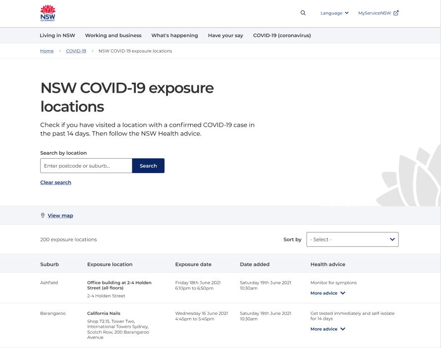
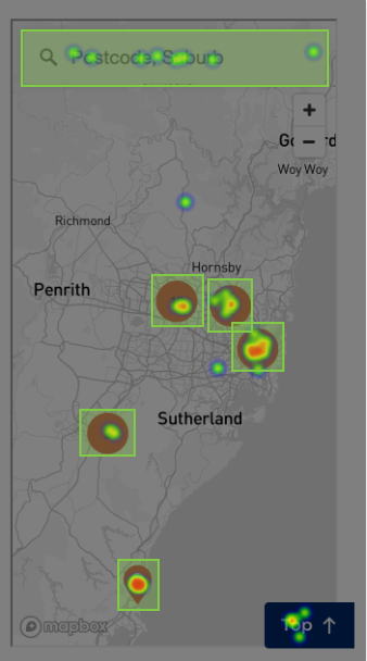
As a result, we designed new versions of the exposure location data in both map and list formats and optimised it for mobile devices. We added the ability to search the list filtered by suburb, exposure date and publish date.
To evaluate the customer’s comprehension of these two formats, we conducted quick usability testing to see what improvements we could make on the user research platform Usability Hub.
What was the testing methodology?
The recruitment panel included 40 participants each for the map and list. As our main objectives were testing navigation usability and comprehension of the wording and labels we’d used, we recruited participants from around the country (not exclusively NSW) in an age range of 18-60+. We focused on a range of digital literacy levels, such as the daily number of hours they spend online and self-reported confidence.
What did you learn from the testing?
The data identified three priority areas for improvement:
"Case location" wording
The wording ‘case location’ was ambiguous; many participants thought it referred to the area where a positive case lives (rather than a location they visited and therefore may have exposed other people).
Pin Icon
Many participants thought the pin icon indicated their own location, or a location they had saved to the map (not an exposure location listing). That made sense to us, as people are familiar with Google and Apple maps that use pins for that reason. We need to consider all digital experiences, not just other COVID-19 related digital experiences.
Circle with numbers icon
While many participants understood the circle with numbers indicated exposure locations, some believed it was the number of positive cases living in an area.
The testing results showed that we have continuous work to do with icon recognition and wording, and we have since made some updates to make it more accessible.
Overall, the map and lists both tested well. Most participants generally understood the map and list exposure locations, as well as how to find out more detail, such as health advice to follow, and how to search and sort.
What has the customer response been?
Outside of the testing, the customer feedback has been positive. The case locations map attracted more than 1.6 million pageviews from its launch (21 June – 12 July 2021) and a 90% ‘thumbs up’ rating on the list format. As you can imagine, case locations are a priority for the team at the moment so we appreciate getting customer feedback!
The COVID-19 exposure locations are a great example of how service design can work with UX and content teams to help improve the delivery and comprehension of COVID-19 data to citizens.
The OneCX program aims to transform the digital experience, making it easier for customers to say, seek and do. Service design is just one of the many elements in how this is brought to life.
Stay in touch
Want to know more about the OneCX program? Subscribe to the newsletter for the latest news and updates.
Isabel Lau & Pip Armstrong
Related OneCX Program blogs


