Advanced table – search and filter
A dynamic table that allows a website visitor to search, filter and browse for information in a tabular view.
Before you start
This component is only compatible with content, micro content and taxonomy content types on a landing page. You should only use this component if you want these types of data to be searched and filtered in a table. Ensure the data is available in the content management system before adding the component onto a page.
Using the Tables
Do
- Use tables to organise and break down complex and large amounts of information.
- Enable the search and filter functionality to make it easier and faster to find information.
Don't
- Use component to only show 1 or 2 items – show the content as it is instead.
- Show information that is not relevant or meaningful.
Add block to landing page
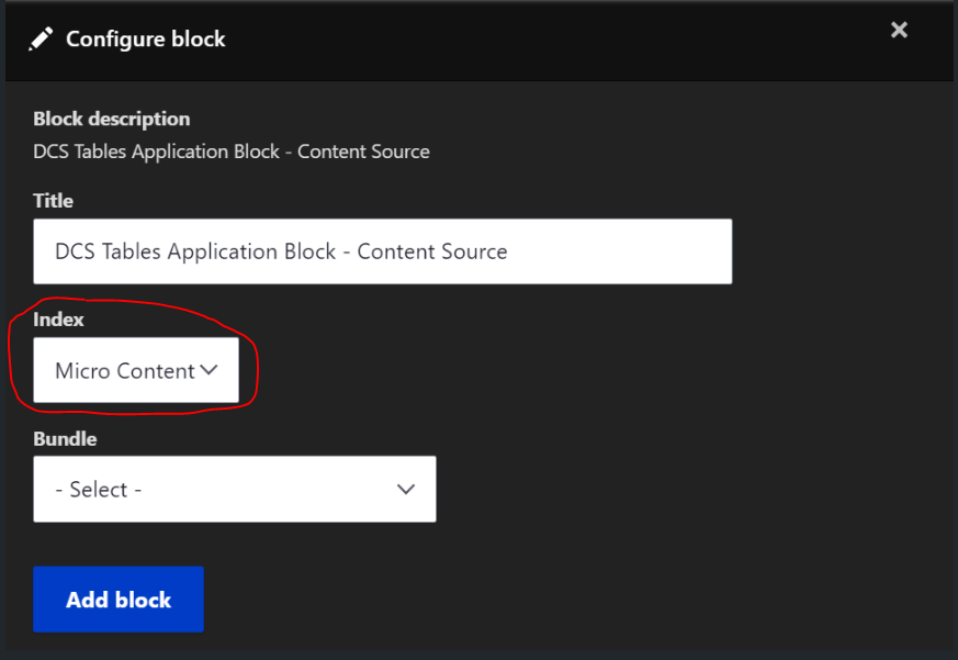
- On a landing page, select Add block and then search and select the DCS Tables Application Block - Content Source.
- On the Index drop down, select 'Content', 'Micro content'or 'Taxonomy'. The Index determines the type of content shown on the table.
- In the Bundle drop down, select the content type you want to display. The Bundle is a sub-content that is chosen as part of the index. The content type options will vary depending on the Index selected:
- Content: Article, event, point of interest, landing page, grant, project, case study, notice, resource, consultation, and landing page.
- Microcontent: Advertising compliance certificates, disaster declaration, DPC disclosure log, DPC policy document, DPC tables document, and live updated blog.
- Taxonomy: Agency taxonomy only.
3. To add the table to the page, select Add block.
Configuring search options
Hide/show search bar: In the Search settings accordion, you can check/uncheck the Enable search checkbox to show or hide the search bar.
Search heading text: Add text to show as the heading of the search component.
Search helper text: Add text description in the field for the search.
Search input label: Add a search label for the search component.
Select searchable fields: You can choose which fields the search functionality should look at when it has been triggered.
Show results on page load checkbox: In the Results settings accordion, check the Show results on page load checkbox to show the table immediately when the page is loaded or uncheck it to hide the table until a search has been conducted.
Configuring the table
You can add up to five columns to show in your table.
Column Header: Enter the name of the column.
Column Field: Select what information you want to show under that column.
Formatter: How you want the column heading to be shown. Default is the standard, and means that just text will be shown.
To show accordions of additional content in table rows:
Label: The label of the accordion.
Column: What field the information is stored in from the CMS.
Formatter: How you want to the column heading to be shown. Default is the standard, and means that just text will be shown
Configuring filters
Show/Hide Results in table: In the Filter settings accordion, check or uncheck this checkbox to show or hide how many results are shown in the table. It is recommended this is enabled for accessibility reasons.
Default number of results shown: Choose from either 25, 50 or 100 results to configure how many results should be shown by default.
Show/Hide filter: Check/uncheck the Enable filter checkbox to show/hide the filter.
Filter placeholder (label): shown on the drop-down filter to let the user understand what kind of filter is available to them. It's recommended that a value is provided as the dropdown does not render properly when it is empty.
Filter field: Choose what field the filter should be shown on the page.
Configuring error and instructional text
No results text: You can configure the message that is shown when there are no results found for a search and/or filter in the No results text field. If this is left blank, a default message will be shown instead. If results are not shown on the load of the page, then the instructions on how to search is shown on the load of the page instead of the table.
Instructions text: A message can be shown on the page if the table is configured to not show immediately on page load. This message is configurable in the Search help text field. If this is left blank, a default message will be shown instead.
Examples of the component
See some examples of how these Advanced Tables are displayed on the page with the different content types.
Content variation
Advanced table with content variation example
Micro content variation
Advanced table with micro content variation example
Taxonomy variation
Live agency page example:
Related information
For more detailed information on different basic table formats and how to edit them see: