Links
Use the Links component to show a group of links in an organised, stylised way that makes it easier for use to scan. The links may go to other internal pages, external websites or to media files.
Using the Links component
The Links component has several variants with different options and displays. Select the variant that suits your content and in context with the overall layout of the page.
Do
- When creating links follow the links guidelines.
- Limit of 10 items per list (break large lists up into smaller ones).
- For external links to other websites, an external icon will automatically appear.
How to add the Links component
- From the drop down Add Links
- Select the Type of links list you want.
- None – displays as a vertical list of links without the option for a heading or summary.
- Text links – Landing pages only. Displays the links in a horizontal line across the section.
- Vertical – displays a vertical list of links with the option to include a heading and summary before the list.
- Two up – option to include a heading and summary that displays on the left of the page, with a vertical link list on the right.
- Chips – to display links to important, relevant, personalised or trending topics. See the full guidelines for chips.
- Link list – 2 columns – displays links in 2 vertical columns. Works best with 4 or more links.
- Link list – 3 columns – displays links in 3 vertical columns. Works best with 6 or more links.
- Sub-navigation – used in an edge-to-edge section on Landing pages only.
- Give your links list a descriptive Heading (optional). Recommended limit of 50 characters.
- Select the heading Type (mandatory):
- H2
- The option – Excluded from in-page navigation – displays when you select the H2.
- H3
- H4
- H5
- H2
- Summary (optional) –include a brief overview of the link list.
- Once you have selected your links list type and added a heading and summary, start building your list.
Add in your Links using either:
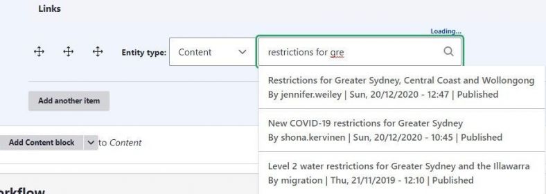
Content - internal pages in the CMS. Start typing the name of the page to search or enter the page node number, for example /node/5215.
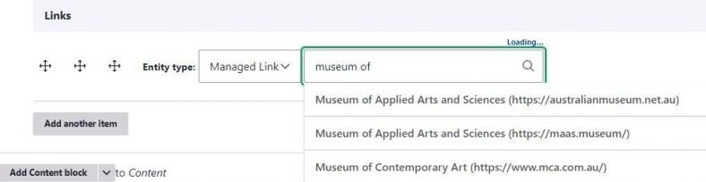
Managed Link - links that have been created in the Managed links library. Start typing the name of the link or paste the full URL in the search box to bring up the Managed link. Learn more about managed links.
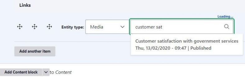
Media - resources like PDFs that have been uploaded to the media library. Start typing the name of the resource/media item to add a link to the item.
- Continue adding link items until you have created your links list.
- Save your page to display the list.


Links list with Chips variant guidelines
The Chips variation has a specific purpose, which is to share important, relevant, targeted, or trending topics. You should be aware that links within the Chips variation may be replaced by with other links due to automated site personalisation. Chips should never be used for general site navigation.
Using the Chips variation
Do
- Use only on standard or landing pages.
- Can be used anywhere on a page, not just at the top.
- Add a heading above your links. The heading provides important context about the links for the user. Heading examples include:
- 'Recommended for you'
- 'Trending topics'.
- Can be used to link to internal pages, external websites or media files.
- The link text (label) should be short and clear. Try to limit the text to 2-3 words. It should be sentence case without a full stop.
- Use Managed Links to customise the label text for external links.
- You can select ‘short title’ for internal links but check the text as it may be too vague for use as the label. (The web pages you’re linking to will need to have short titles added to them). See how to add a short title to a standard page or a landing page.
- Do not use generic link names, such as, 'Contact us' or 'Read more'. Generic links make no sense out of context and don't tell the audience where the link will take them.
- It’s recommended to add 3 – 5 links, although you can add up to 7 links if necessary.
Don’t
- Use for generic navigational links. This dilutes the importance and prominence of the component. Instead, consider using Cards, other Link List variations such as the sub-navigation links instead for navigational links.
- If the link is associated with a task, such as registering or booking, a call-to-action (CTA) button should be used instead. Find out more about buttons.
- Don’t use more than 1 on a page.
Examples of link list displays
1. - None -
2. Vertical
Example – vertical link list
Summary text above the vertical link list. Summary text above the vertical link list.
3. Two up
Example – two up link list
Summary text two up link list. Summary text two up link list.
4. Link list – 2 columns
Heading for 2 column link list
Two column summary. Two column summary. Two column summary. Two column summary. Two column summary. Two column summary. Two column summary.
5. Link list – 3 columns
Heading 3 column link list
Add a summary to give the audience information about the list. Add a summary to give the audience information about the list.
6. Chips
Live examples
You can see live examples of how agencies have applied the component to their content.
Text links
- The Cabinet Office – Ministers' diary disclosures
- Department of Customer Service – Free training and coaching